


Red: too often it is treated as a one-note color (for passion). A burst of red absolutely catches the eye and makes a statement, but that statement can be quite varied and sophisticated. Here are some works from Seattle Art Fair 2016 that feature red in diverse ways.
Jerald Melberg Gallery (Charlotte, NC), Booth C31
“Red Sea” by Robert Motherwell

“RED SEA II” by Robert Motherwell, 1979, Aquatint, Lift-Ground Etching and Aquatint on German etcning paper, 34.5″ x 29″. Image courtesy of Jerald Melberg Gallery.
Robert Motherwell distinguished himself among the Abstract Expressionists with this peculiar automatic style of painting. He eventually translated that mode into etching and aquatint in several series of black on red prints. The 1979 “Red Sea” series was (in my humble opinion) among the more genuinely striking. It is well placed at the front of Jerald Melberg Gallery‘s booth, enticing one in to see a number of subtler Motherwells on display. Red means go, in this case.
See more from the Jerald Melberg Gallery booth.
Edward Tyler Nahem Gallery (New York City, NY), Booth D7
“Jerusalem Stabile” by Alexander Calder
Calder’s “Jerusalem Stabile” exists in various sizes and notable locations around the world. It was one of the last monumental sculptures Calder would design and it was installed on Mt. Herzl in Jerusalem in 1977, a year after his death and just shy of thirty years from the founding of Israel. The intermediate maquette of it sits at Edward Nahem Gallery. The sculpture was meant to symbolize hope and modernity in Jersualem. Its attractive form still looks modern, but it’s up to the individual observer to see hope. (Putting all the history aside, I personally see an explosion.)
See more from Edward Tyler Nahem’s booth.
KOKI ARTS (Tokyo, Japan), Booth B25
“Empirical” by Mario Trejo
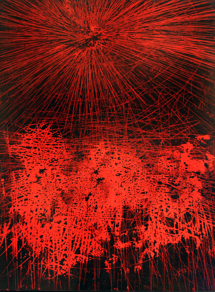
“Empirical” by Mario Trejo, archival ink, enamel on panel. Image courtesy of KOKI ARTS.
24″ x 18″
Mario Trejo‘s work is a craze of lines, but it isn’t entirely random. He manages to get a real sense of depth in his work, although you can’t really tell which end is up in the case of “Empirical,” where nebulous and radiant forms collide. I recommend checking out his whole range, which can be more latticed and gridded, and often uses more subdued colors. “Empirical” caught my eye because it really captures the energetic, generative and explosive frenzy that I associate with red as a color (especially this hyper-saturated cadmium.
See more from the KOKI ARTS booth.
Wildwood Press (St. Louis, MO), Booth A30
“Strong Suit” by Gary Paller
“Strong Suit” by Gary Paller, 2013, relief/collagraph, 50” x 62.5”. Image courtesy of Wildwood Press.
Contrast with the subdued and hematic globules of the large collograph “Strong Suit” by Gary Paller. The red here is not monotone; it’s rich and velvety, as are the black interstices (which on their own might have sympathy with both the work of Calder and Motherwell, actually). This is a more nurturing red, and the way the cells of it stretch and plump across the paper is itself oddly comforting to the eye. It’s a big piece that exudes warmth without burning too hot.
See more from the Wildwood Press booth.
The 2016 Seattle Art Fair runs from August 4 through August 7. Learn more and buy passes on the Seattle Art Fair website, and check out all our coverage of the booths, events and the vision of the fair as a whole.


